
Bucks County Free Library Visual Identity Rebrand
Design: Design Research, Branding, Print Design, Signage & Wayfinding, Environmental Graphics, Social Media,
The Bucks County Free Library is a seven–branch library system that serves a county of over 850,000 residents of all ages. The library is known for its innovative services, expansive collection, friendly and expert staff, and clean facilities. Despite being one of the most up-to-date libraries in Pennsylvania, it faced the challenge of appearing as a modern institution.
The rebrand's goal was to make the library's visual identity appear modern, friendly, and timeless while creating a centralized identity to unify each branch. This required the visual identity to be modular with various logo lockups, color palettes, and patterns.
Logo Redesign
Redesigning the logo proved challenging within a community that embraces legacy and tradition.
Although the library went through multiple identities since its start, there was little documentation of all the logos that represented BCFL.
Inspiration for the updated logo was found through ephemera the library published in the 50’s, 60’s, and 70’s; most predominantly the geometric and chunky modern typography, and illustrations. Using an international style font ensures modernity, friendliness, and timelessness.

Modularity
Seven branches, multiple departments, and several large services make up the Bucks County Free Library. We knew since the beginning of the project that the logo would need to be modular so it can live wherever it needs to.
Whether it’s large on the side of the building, or minuscule on a little bookmark the logo had to be there. The various logo lockups allow the system to live, breathe, and adapt to any environment.

Color Palette
We didn’t want to choose a contemporary palette that would date the identity of the library. But we also didn’t want to be like every other library and be represented by a limited palette.
We chose a wide color palette that allows the library to look fun, memorable, and distinct. The wide array of colors allows for unique combinations that represent different departments, programs, and services.

The Grid
We knew since the beginning of the project that we wanted to use geometry as a visual identifier. Installing the grid allowed across multiple visual assets like slide decks, bookmarks, and program guides allowed us to ensure visual consistency throughout all branded items.We also knew that staff with no previous design experience
would create visual materials for their branches. Each branch has unique programming, events, and services requiring staff to be able to create materials to promote those things. The grid creates a template for staff to design responsibly within the brand guidelines with little experience.


Stationery Package
Although most of the stationery items are sent and received by staff and internal stakeholders, redesigning them was still important. Receiving internal mail on official letterhead made announcements and news feel important and official.
Additional items like the action memo, large envelopes, and mail memo made receiving documents and mail from staff at other branches fun and exciting.
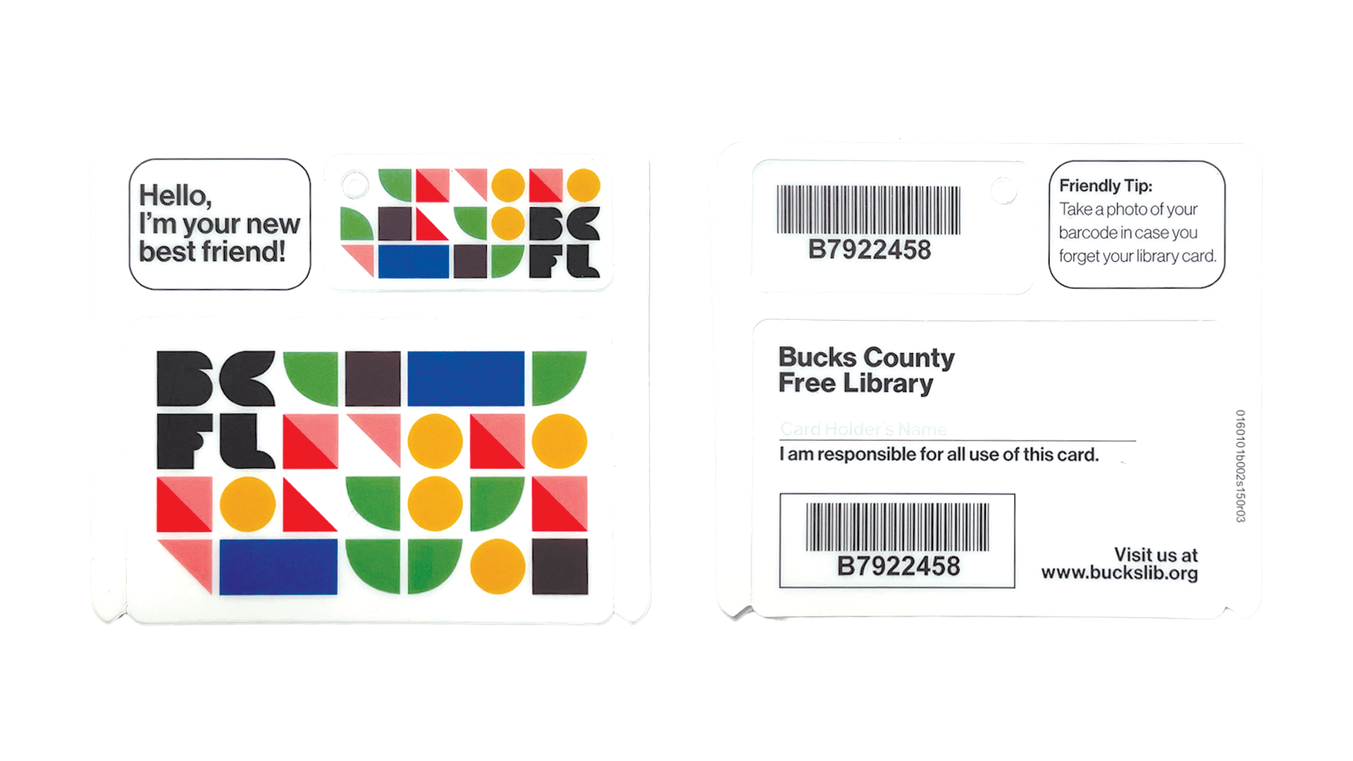

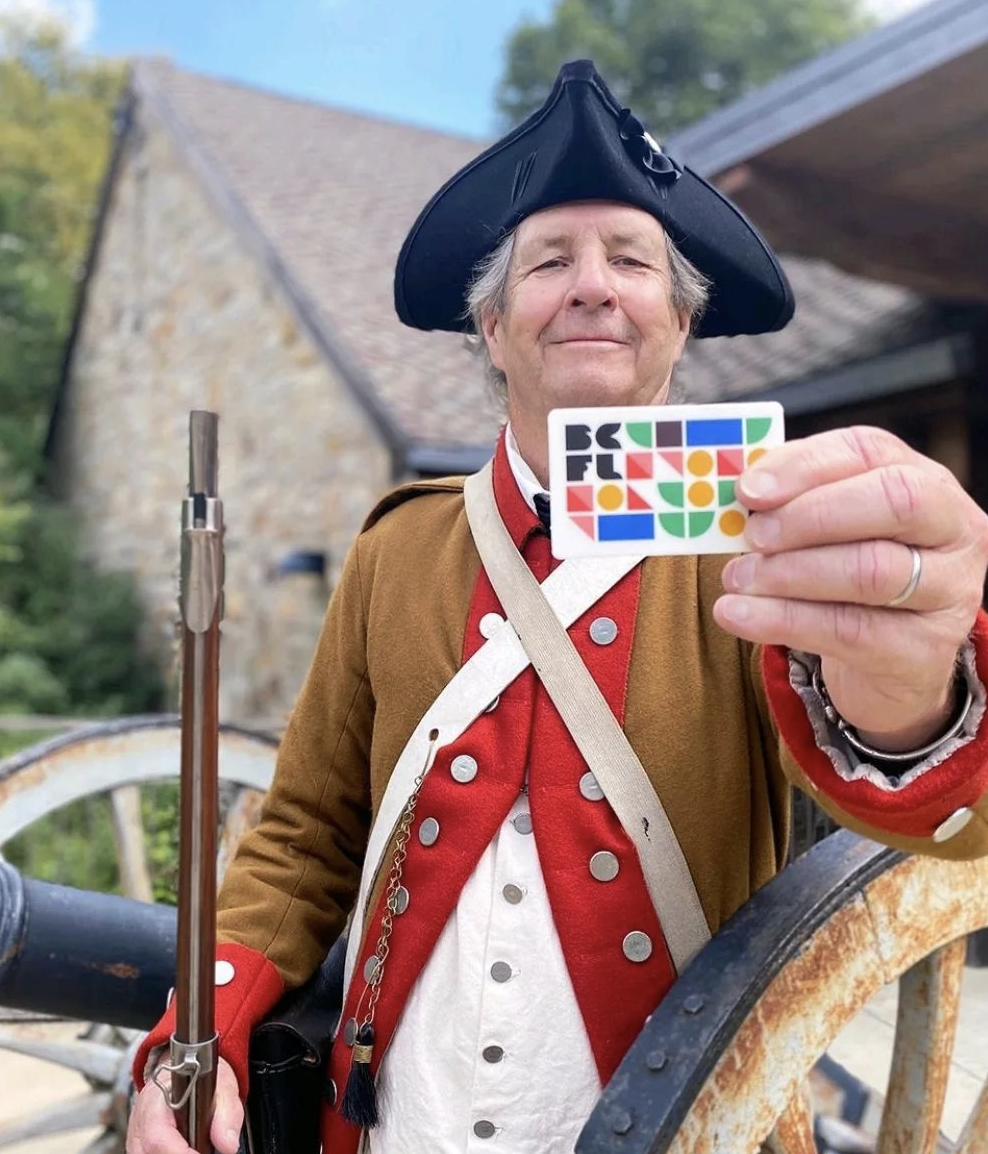

The Library Card
The library card is the most critical touchpoint for every library. It is the access point for each library patron and reminds everyone just how important it is. Keeping the design simple was important as it made the card timeless, unlike previous designs that made it feel dated and old.
Once this card was released to the public, the library saw an influx of patrons looking to exchange their previous cards for this new upgrade.


Guides
All announcements, program dates, and information about each branch can be found on the library’s website. But our research showed that patrons prefer physical handouts for their information.
These guides are essential. Programming guides featuring children’s services and events were released each month.
Although only seven libraries are in the Bucks County Free Library system, we partnered up with the other libraries in the county to create a guide that showed patrons the resources they have access to as a resident of the county.

Volunteer Materials
Volunteers provide the extra support that makes staff lives easier.
BCFL relies on volunteers for routine tasks that allow staff to focus on helping patrons.
Volunteer materials are created to notify the public and encourage them to help out at any branch they want.


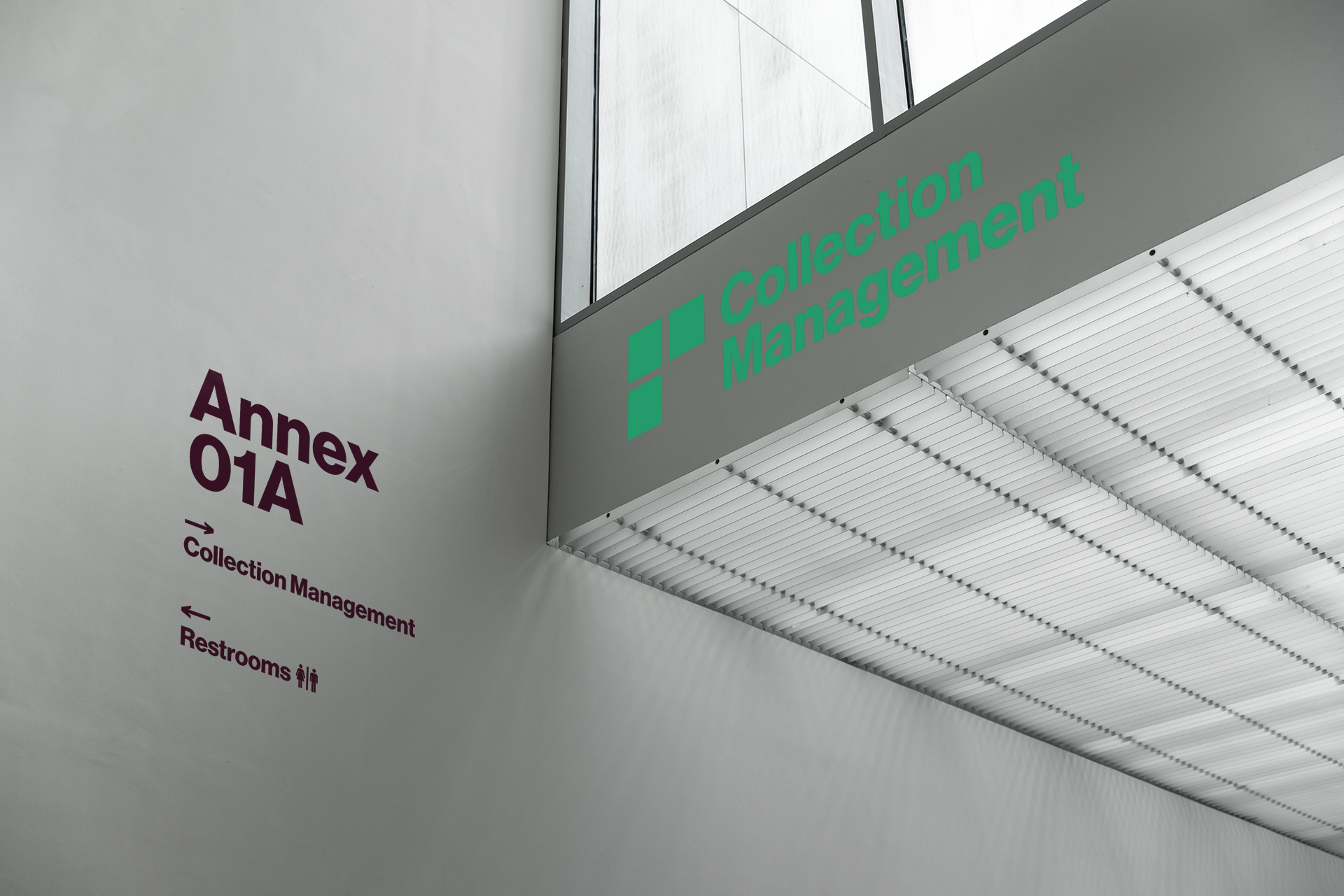


Wayfinding & Signage
Before the rebrand, each branch had its own signage systems. Patrons who visited each branch wouldn’t know they all fell under the same brand.
After an audit of each branch, common signs found at all seven branches were redesigned and distributed.
Certain signs like room labels, placards, and wayfinding are permanent and only created once.
Signs notifying patrons of closings, delays, and temporary information are templated and produced in-house by created by library staff as needed.


Donor Materials
Donors are vital to the Bucks County Free Library and are considered internal stakeholders. Different assets can be designed differently depending on the campaign, time of year, and donor.
Materials can be toned down and conservative for an end-of-the-year donation or amplified and playful to show the results of a fantastic year in an annual report.


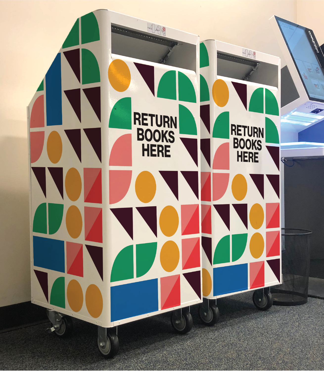

Environmental Graphics
Creating a fun and exciting space was an important part of this rebrand. Creating environmental graphics for key library touchpoints made them easy to find at each branch and fun interacting with.
No matter where a patron was in the library it was easy for them to identify the digital kiosks where they could check out books and learn new info, find the book drop to return their books, or enticed to walk down corridors to find meeting rooms or restrooms.

Library Promotionals
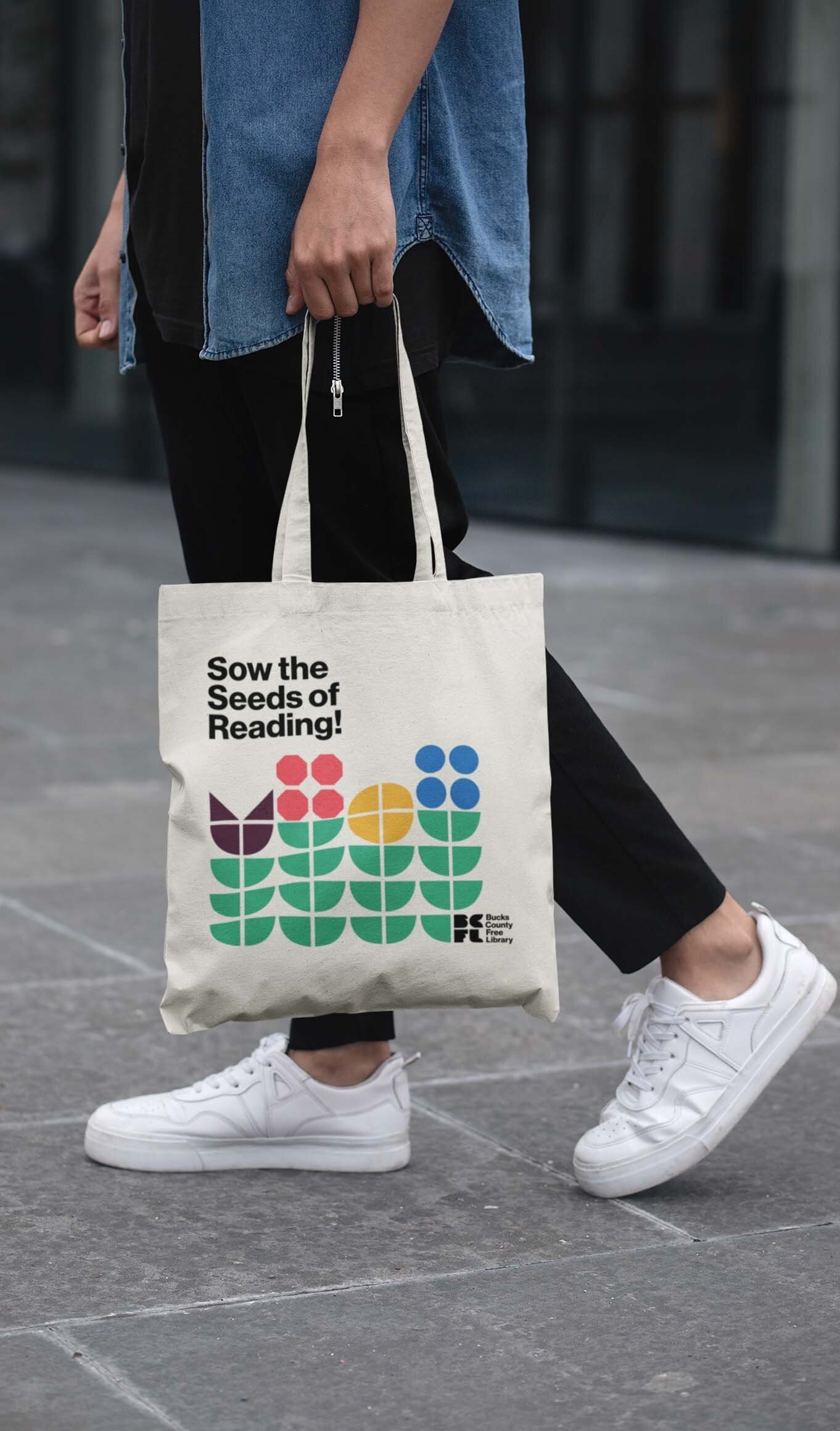
Whether it’s during outreach events, reading sprints, or other programs at the library, BCFL distributed lots of free bookish goods like tote bags, bookmarks, badges, and extras.
Although most libraries give away free goods, we ensured ours were always desired and actively shown off, encouraging more people knew to visit their local BCFL branch.

Digital Information
Making patrons aware of new information used to be difficult. With most patrons not following us on social media the only way they could get information without stopping at a branch is through our website
We utilized our homepage as a digital message board. Creating intriguing, yet simple graphics ensured that patrons were always up-to-date on current affairs about library happenings before visiting their local branch.


Social Media
Our most loyal fans follow us on social media. Within the mix of photos of book unboxings, and happy patrons we shared library news, programming updates, and event information with our fans
Creating dynamic graphics ensured our followers immediately knew it was a BCFL update amongst the other posts on their digital feeds.
Despite initial backlash when the rebrand was unveiled to the public, the public quickly changed their minds and learned to love the library’s new identity. As more rebranded touchpoints were distributed to the public people became more passionate about how professional, fun, and modern the library was trying to be.
Most residents now find it difficult to imagine their favorite library looking any other way.
Staff, the Board of Directors, and key donors also love that all seven branches are now visually unified and the patron experience is consistent.