The Literacy Center
Design: Design Research, Branding, Print Design, Presentation Design, & Social Media
The Literacy Center is a private, non-profit organization dedicated to empowering adults through community-based literacy education. Founded in 1977, they’ve served residents of the Lehigh Valley, helping them improve their lives, their families, and their community by strengthening their literacy skills.
The Literacy Center has helped thousands of students from all over the world achieve their goals. Whether it was achieving their GED to find a better career, learning employment skills to get a better paying job, or learning English so they can communicate with their neighbors, The Literacy Center provides invaluable resources for free to those who need them most.
During the pandemic, they had to close their classrooms and redesign their programs and services to accommodate for online learning.
The Literacy Center sought a rebrand to modernize their identity and make it more relevant to all of the new programs and services they offered since the conception of their previous logo.
The Logo
The previous logo was created when the center focused on literacy and helping adults achieve their GEDs. They wanted their new logo to reflect all the new programs like ESL, workforce development, and career services.
The new logo combines the book from the previous logo with a text bubble to emphasize the inclusion of language and online learning.
Logo Variations
Like many other organizations, The Literacy Center wears many hats. Providing a wide range of services requires a wide range of marketing channels.
Whether reaching out to new students via a brochure, newspaper ad, a Facebook post, or a small note, The Literacy Center needs to be represented by a mark that can be big or small.
Color Palette
The original color palette consisted of just scarlet. The client wanted to keep the color because it signified the passion the staff, volunteers, and students had. The palette was expanded with rose and blush to add value to the existing color palette.
Navy and blue were added to signify knowledge and education. Together the two represent the passion for intelligence the staff and students share.
Programming Catalog
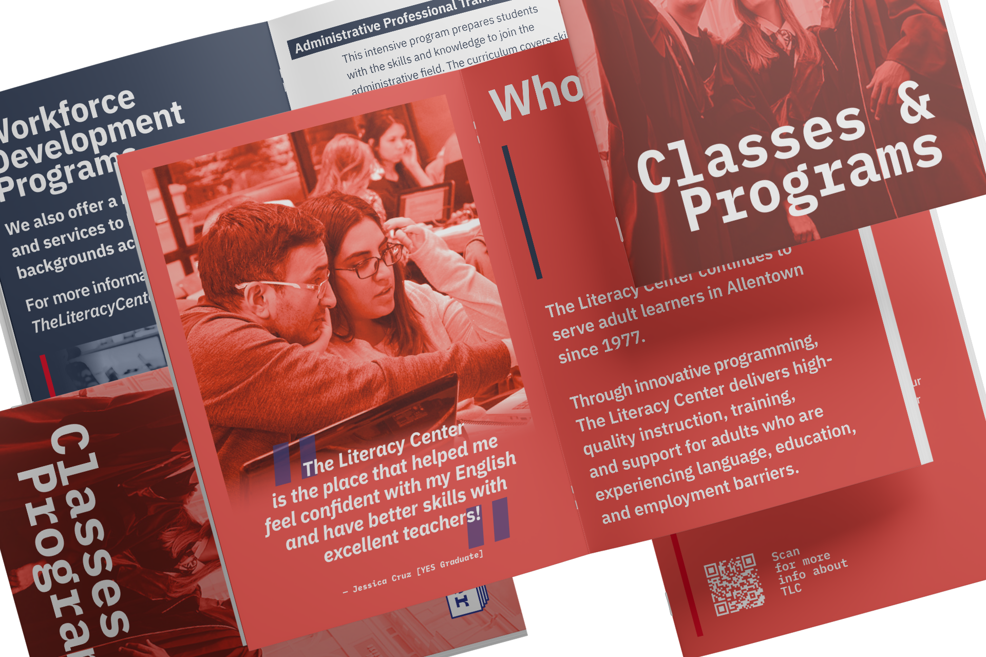
Through user research we discovered that one of the most important touchpoints for potential students is printed collateral. Whether it was a brochure, flier, or newspaper article most students reported that they learned of The Literacy Center through family or friend who handed it to them.
After analyzing the web traffic, we discovered that most people landed on The Literacy Center’s website from a direct search or a direct link from The Center’s social media channels.
This catalog is designed to quickly outline each program and service and provide a QR code for students to access more information and registration forms.
The booklet is printed on heavy-duty paper to ensure that it can be passed to multiple students before needing to be recycled.
Workforce Development
Workforce Development is one of the quickest developing services at The Literacy Center.
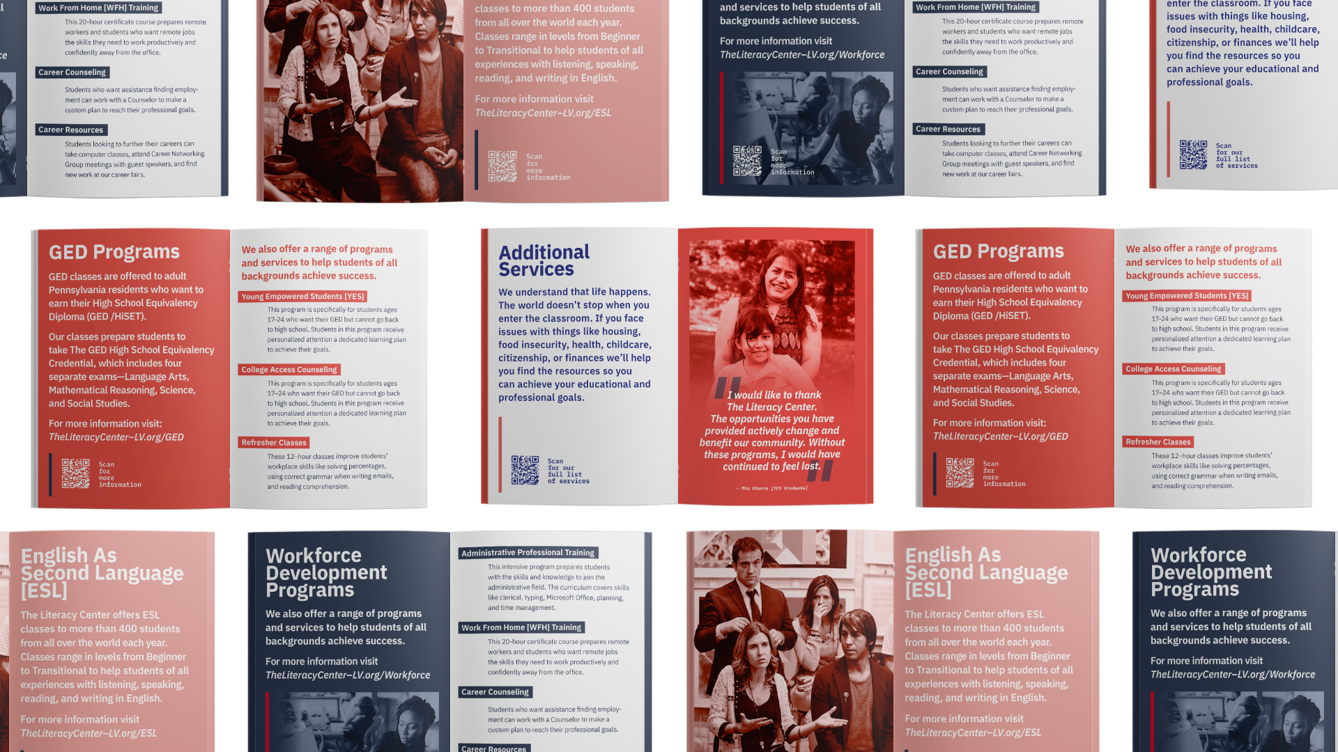
To promote these services, we created a pamphlet to be dispersed at career fairs, community partners, festivals, and block parties.
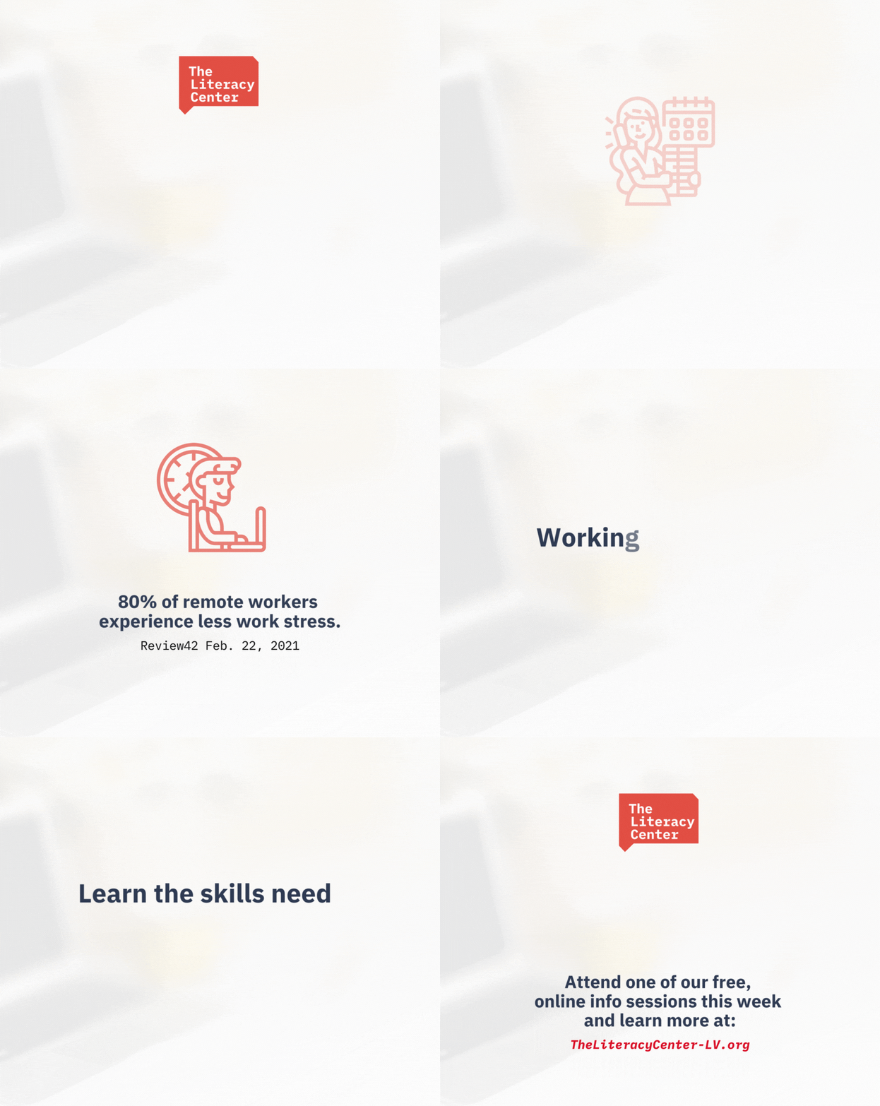
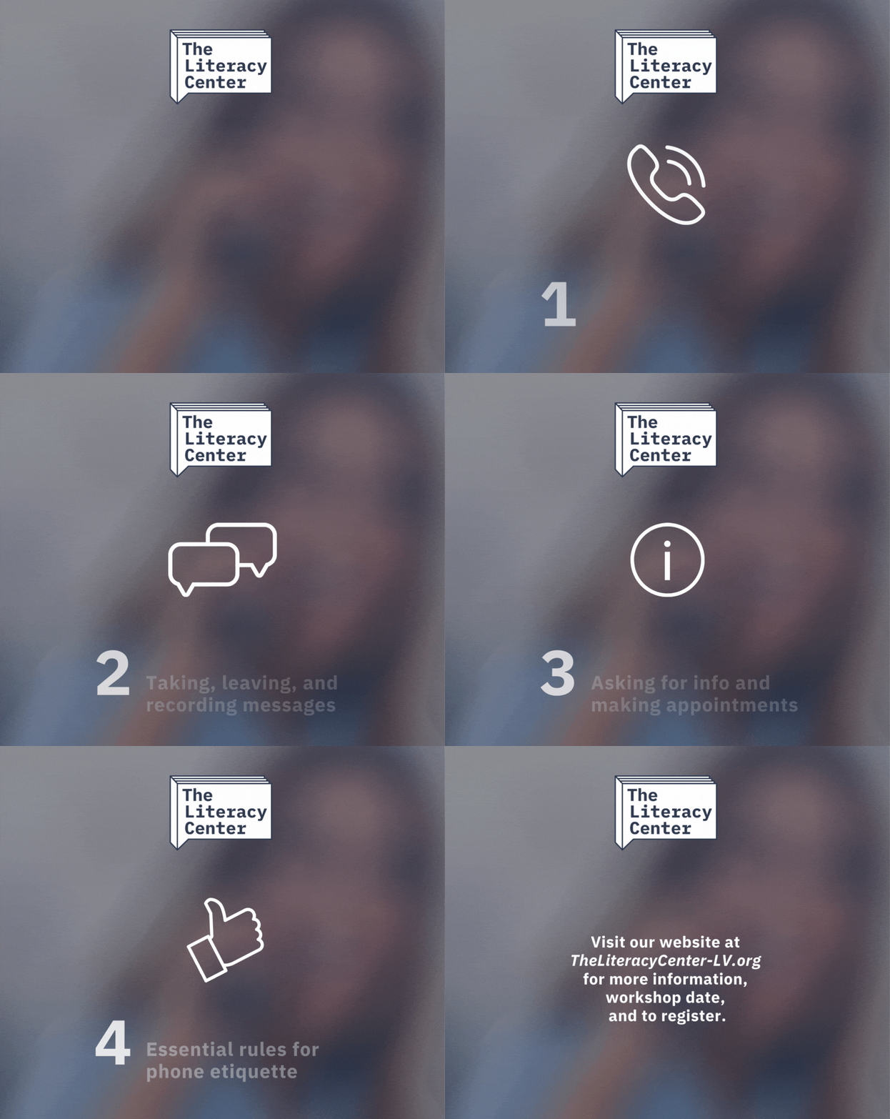
We also created a series of social media posts to be shared via Facebook, LinkedIn, and email. We heavily relied on gifs and animations to gain viewer attention.
GED & Educational Resources
The Literacy Center is known for its GED program. After their high success, they expanded this program to reach out to and adapt programming to help young adults who are unable to go back to high school.
We created a pamphlet to be dispersed at community centers, community colleges, food banks, and technical centers.
We also created multiple slide decks and presentations for staff to present at partnered organizations to recruit more students.
Volunteer Materials
The Literacy Center runs on a small team of staff. Volunteers are important in making sure students receive the additional support and help they need outside of the classroom.
We created presentations and digital fliers to reach out to and recruit new volunteers.
We also created a special t-shirt for every volunteer to show our thanks and appreciation.
Digital Content
Most of The Literacy Center’s programming moved from the classroom and online during the pandemic. After the rising success of these online programs, it was decided that most programming would remain online. Because of this most promotional materials moved online as well.
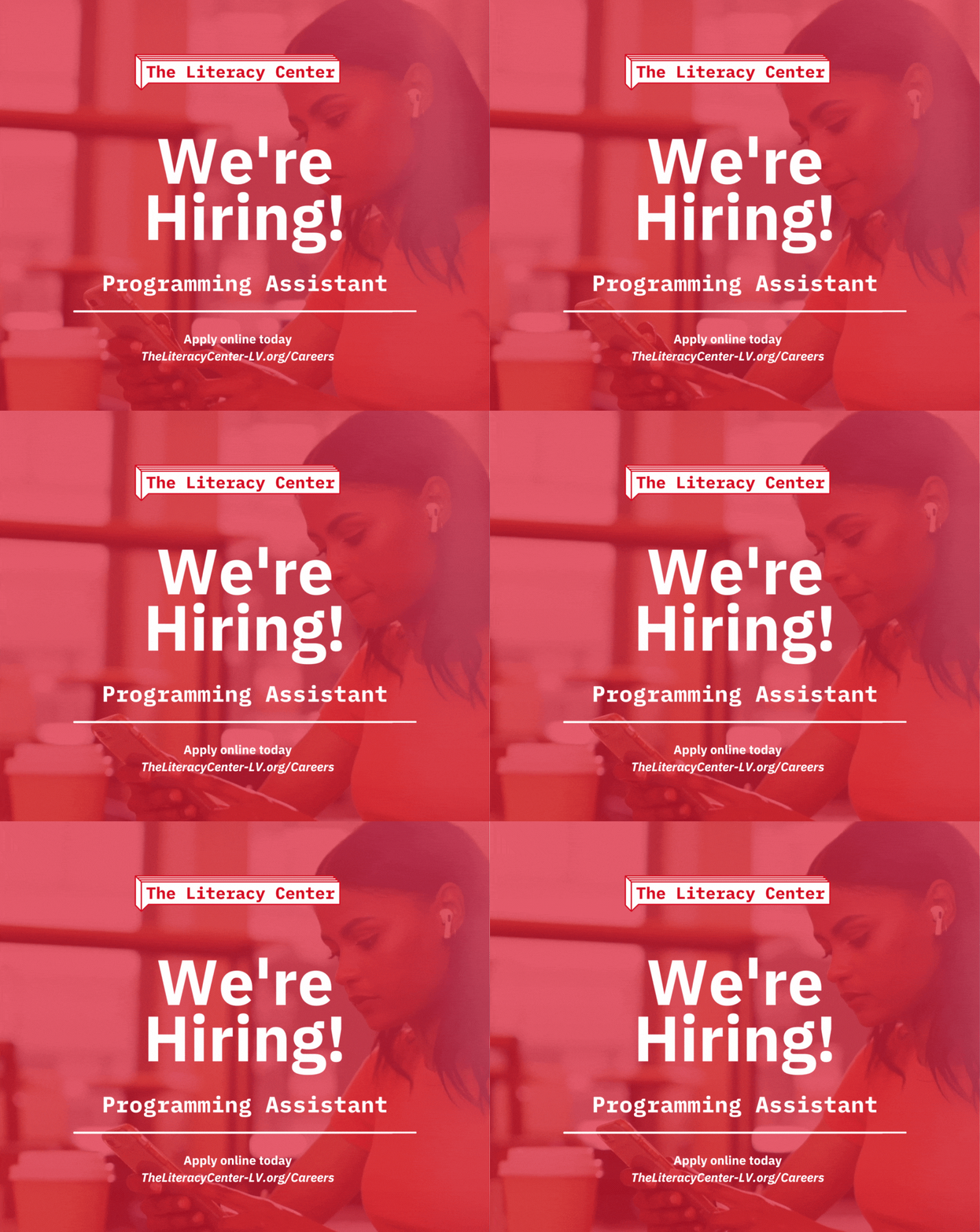
Creating content is important for The Literacy Center because it’s free, spreads to lots of people, and it’s engaging.
We focused on creating bold graphics with little to no text to ensure people with any education background received our message.
